2021 SEPT — UI/UX DESIGN, USER RESEARCH, INFORMATION DESIGN
OLLIE
Interactive map and social platform working to share knowledge and develop community within the local skate demographic in Davis, CA.
Duration — Five weeks
Tools — Figma, Miro, After Effects

Context
Skating as a subculture is historically known for its intensity and “anti-establishment” sentiments. For these reasons, it is often intimidating to attempt skating as an adult and find belonging within the community as someone who picking up a board for their first time. The intimidation and feelings of imposter syndrome experienced by new skaters can limit them from going to skateparks and practicing around more advanced skaters.
Additionally, the commute to skateparks can often be inaccessible to many and finding local street spots to skate can be a difficult process for both new and veteran skater who may not be as familiar with what comprises a good spot or for those that simply don’t have time to go exploring until they find the perfect skating ledge, so finding local street spots to practice is a useful resource. With this information in mind, I chose to examine this problem further within the Davis skate community.
Additionally, the commute to skateparks can often be inaccessible to many and finding local street spots to skate can be a difficult process for both new and veteran skater who may not be as familiar with what comprises a good spot or for those that simply don’t have time to go exploring until they find the perfect skating ledge, so finding local street spots to practice is a useful resource. With this information in mind, I chose to examine this problem further within the Davis skate community.
Problem 🔍
There is a lack of resources and support for the skate community and new skaters in Davis, such as skate clubs on campus, community meetups, or shared knowledge about street skate spots with less experienced riders. For new skaters, this acts as another reason why skate culture can feel inaccessible or intimidating.
Solution 💡
OLLIE is an app that addresses skate intimidation and information inaccessibility by providing a living map of skate spots with detailed information and the ability to share content to reinforce community and support amongst Davis skaters and to encourage new skaters to practice at local skate spots. Skaters can connect with the larger Davis skate community and know what to expect when trying out different skate spots.
PRIMARY RESEARCH PT I
Audience Interviews & Surveys
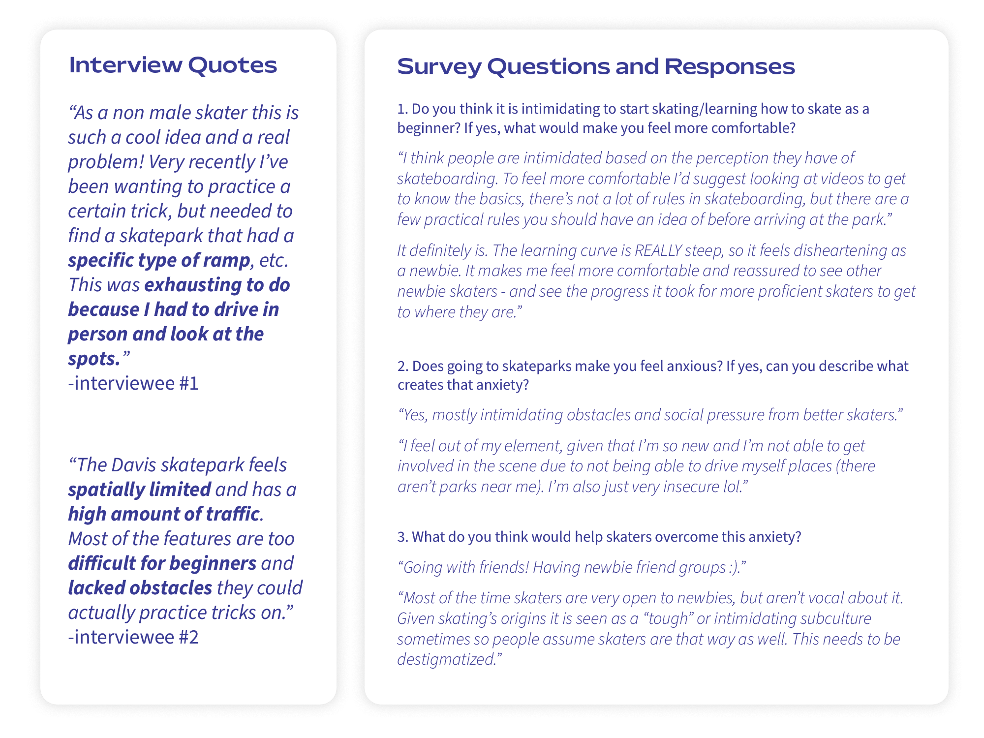
To learn more about this problem and better understand the experiences of my target audience, I interviewed two new skaters in Davis. I also sent out a Google Forms survey to the broader skate community to identify a specific pain point and potential solutions that would address their needs.
![]()
IDEATION
How Might We Statements
How Might We Statements
With a clear understanding of my audience and their preferences, I moved to the next phase in my research that identified companies with a similar goal as mine, as well as ones that my audience frequently used. In my competitive analysis research, I focused on how these apps approached three specific tasks, navigation bar design, visual identity, as well as their overall strengths and weaknesses.
After conducting my first stages of research, I synthesized my findings into a series of "How Might We..." statements to determine exactly what problems I wanted to concentrate on with my design solution.
![]()
After conducting my first stages of research, I synthesized my findings into a series of "How Might We..." statements to determine exactly what problems I wanted to concentrate on with my design solution.

SECONDARY RESEARCH
Comparative Analysis
With my “how might we” statements, I decided to develop an app that would map out different skate spots on the UC Davis campus that would also allow users to upload their own content and engage with the broader Davis skate community.
To start, I began researching for skate resources such as maps of local street spots, Facebook groups for skaters, or any documentation of skating knowledge for folks in Davis.
Through my research, I discovered there was a significant lack of public knowledge or resources for the Davis skate community. When searching for local skate spots in Davis, I found one resource that listed 3 spots on campus, all extremely difficult and apt for very advanced skaters.
Additionally, I found no online communities or groups for skaters in Davis to connect or interact with each other. This prompted me to consider ways in which I could help skaters in Davis meet each other or even connect virtually to receive advice and ask and answer each others questions.
PRIMARY RESEARCH PT II
Surveys, Data Collection, & Mapping
Surveys, Data Collection, & Mapping
Surveys
Before working on my prototype, I conducted a survey through Google Surveys to determine what categories of information for a skate spot would be most useful for my audience.
This survey informed me that it was extremely important to include terrain type/conditions of the spot, as well as the skill level it was best suited for. Since my app would most actively engage newer skaters, this category would support them in easily finding places to practice that were suited for their more limited skillset. They survey also indicated that foot traffic, types of features, and a caution section that would describe risks, hazards, or legality were also important information categories to include.
![]()
Location Scouting and Image Documentation
Using online tools, first hand-knowledge, and guidance from primary sources, I visited various locations to document and include in the app.
![]()
Data Entry
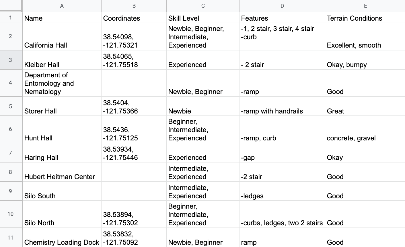
After scouting locations, I documented these data points on a spreadsheet and complied further qualitative data to organize the different categories of information for each location.
![]()
Location Mapping
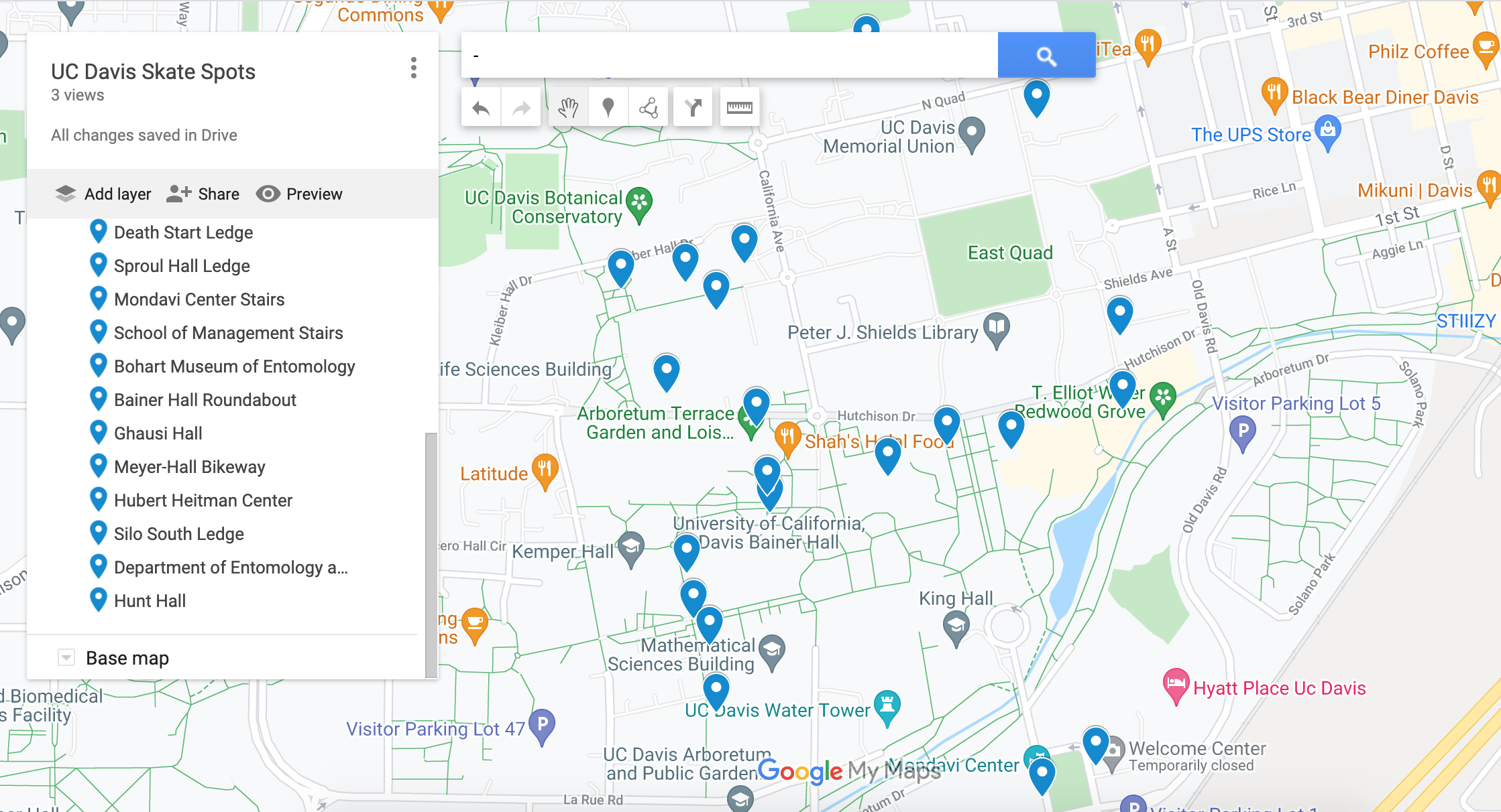
After compling my data points, I used Google Maps to visually document and define these location points gain a better idea their the promoxity to each other and scale in relation to city boundaries. I then leveraged this map as a template for designing the visual map within the app.
![]()
Before working on my prototype, I conducted a survey through Google Surveys to determine what categories of information for a skate spot would be most useful for my audience.
This survey informed me that it was extremely important to include terrain type/conditions of the spot, as well as the skill level it was best suited for. Since my app would most actively engage newer skaters, this category would support them in easily finding places to practice that were suited for their more limited skillset. They survey also indicated that foot traffic, types of features, and a caution section that would describe risks, hazards, or legality were also important information categories to include.

Location Scouting and Image Documentation
Using online tools, first hand-knowledge, and guidance from primary sources, I visited various locations to document and include in the app.

Data Entry
After scouting locations, I documented these data points on a spreadsheet and complied further qualitative data to organize the different categories of information for each location.
Location Mapping
After compling my data points, I used Google Maps to visually document and define these location points gain a better idea their the promoxity to each other and scale in relation to city boundaries. I then leveraged this map as a template for designing the visual map within the app.
DESIGN
Lo-Fi Prototypes
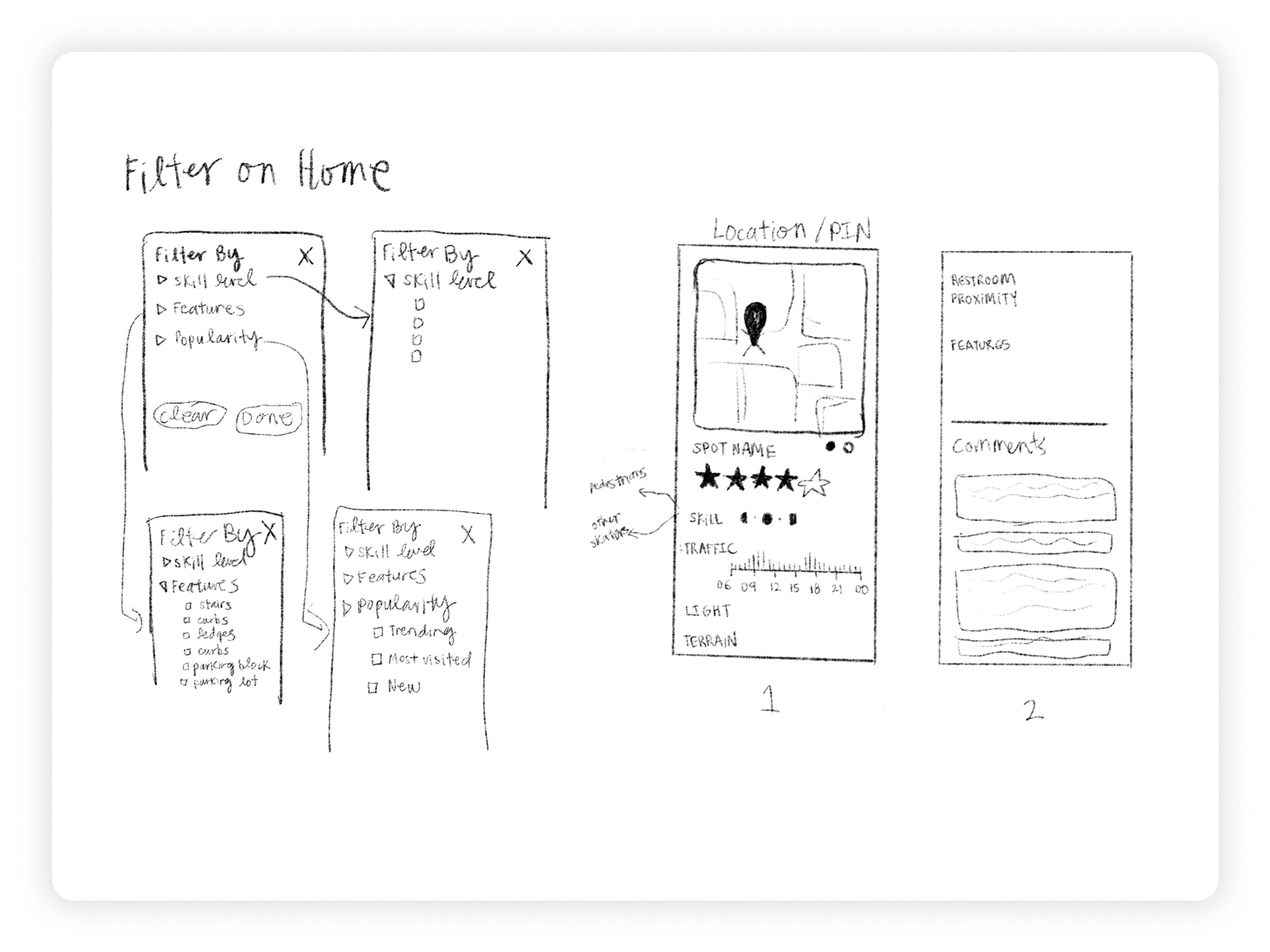
In my low-fi sketches, I took to pencil and paper to define the main screens that would visually synthesize my research into easy-to-understand content. In this phase, I established a reductive user journey that helped me identify the principal screens I needed to strategically and visually solve for — Home Page, Filter Pop-up on Home Page, Unique Location Page, Location Review Page.
Through these sketches, I iterated on different solutions for organizaing and conveying different categories of information. These basic wireframes helped me configure the simpliest user journey one could take that helped me visualize the different categories of information I wanted to display for each spot.
![]()
Through these sketches, I iterated on different solutions for organizaing and conveying different categories of information. These basic wireframes helped me configure the simpliest user journey one could take that helped me visualize the different categories of information I wanted to display for each spot.
DESIGN
Mid-Fi Prototypes
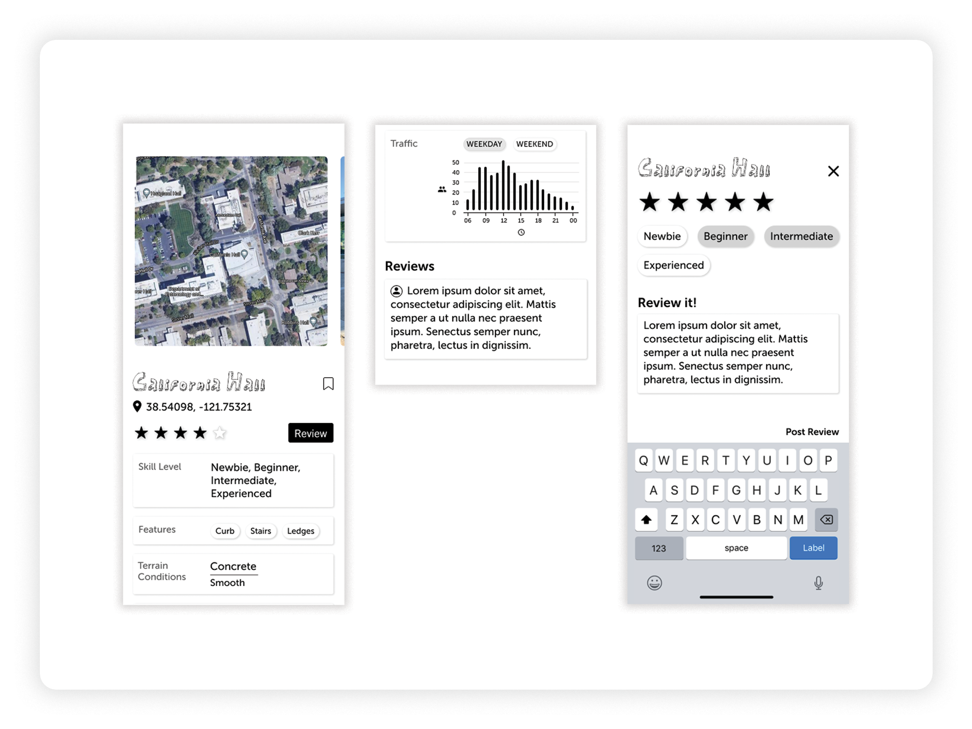
In my mid-fi Iterations, I experimented with different forms of displaying and chunking information. I tested on users to determine what organization patterns most effectively communicated the data.
![]()
USER TESTING
10-Second Impressions
After developing my mid-fi prototypes, I did an initial 10-second impression with my target audience to determine how well they could navigate the prototype and understand its purpose without explanation. My audience remarked it was:
“Intuitive, the UI is clean and clearly facilitates the different user flows within the app”. — peer
“Intuitive, the UI is clean and clearly facilitates the different user flows within the app”. — peer
USER TESTING
A/B Tests
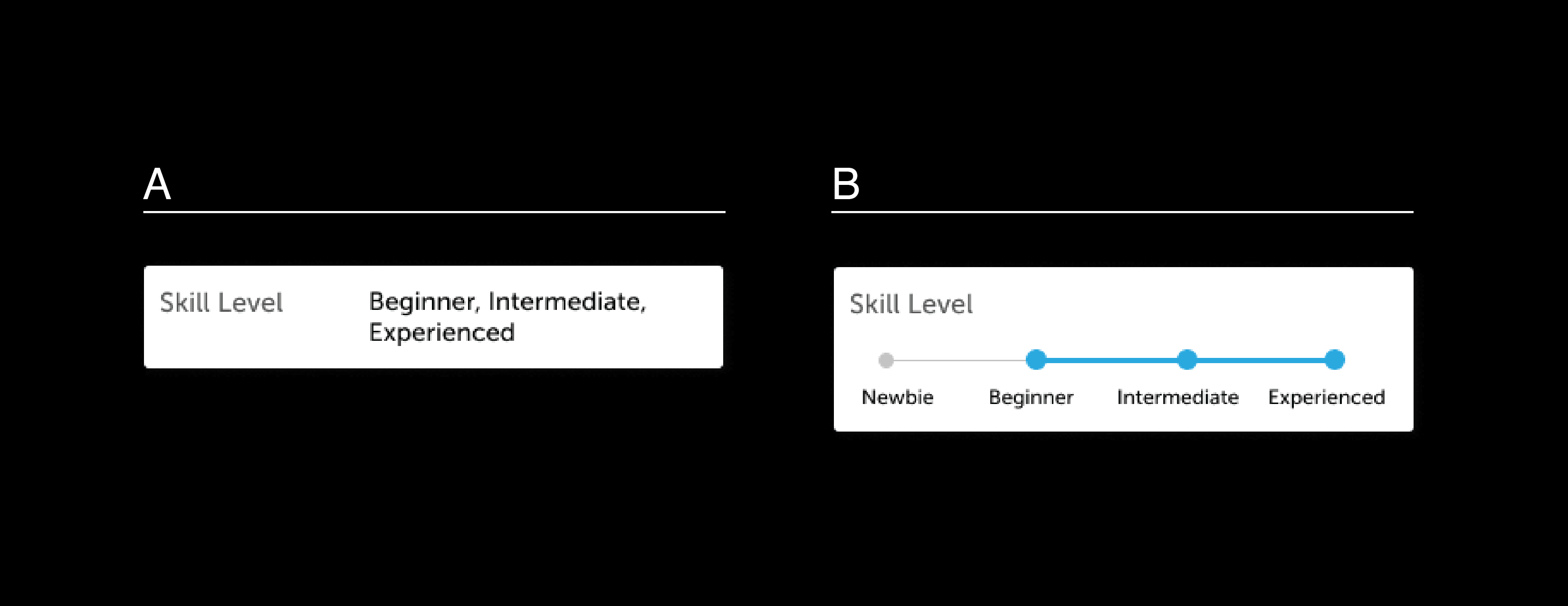
To help inform the most ideal strategies of information visualization, I engaged my target audience to conduct A/B testing on different ways of conveying the information categories for each skate spot location.
Skill Level
My audience responded that option A was confusing because listing the skill levels didn’t clearly denote if this was a general skill ranking or specific to this spot. I found option B allowed my audience to better understand the range of skill levels and exactly which ones applied to the specific location.
![]()
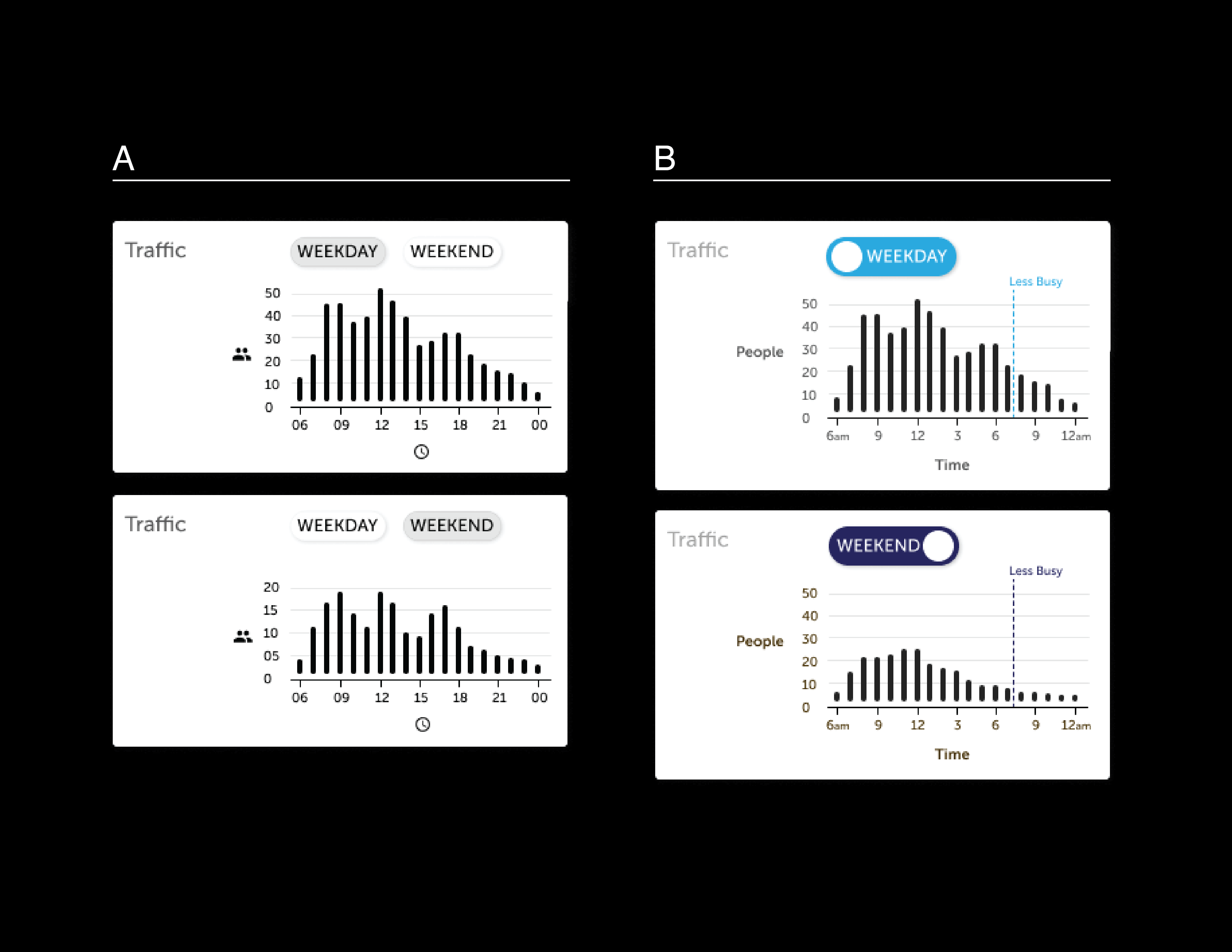
Traffic Chart
My audience expressed the labeled axis on option B made is easier to understand. Additionally, am/pm was more clear than military time. The current time marker also helped make the information heavy chart easier to navigate.
![]()
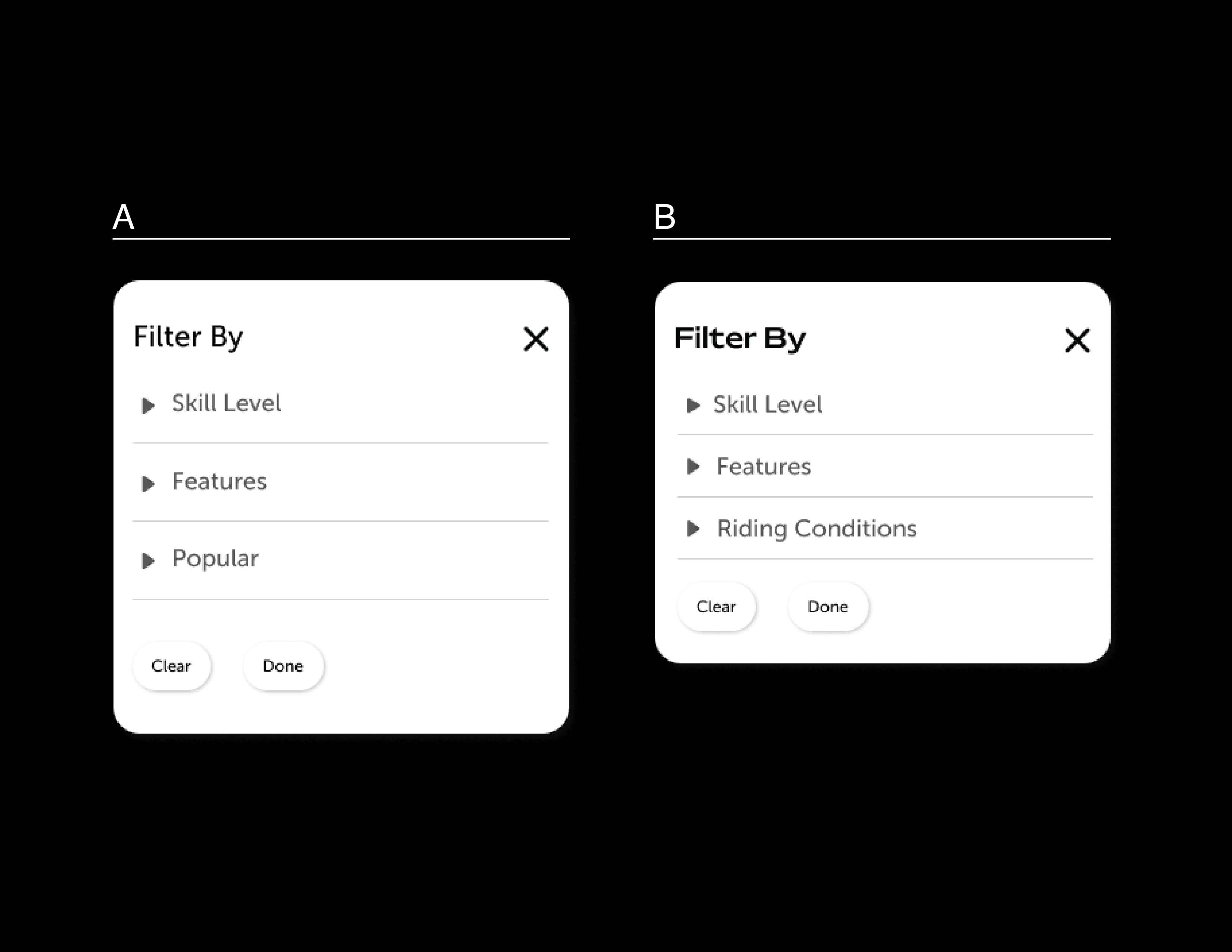
Filter Options
My audience preferred option B because they felt that they would filter by “riding conditions” more often than “popularity.” Some also remarked that they didn’t entirely understand what “popularity” entailed.
![]()
Skill Level
My audience responded that option A was confusing because listing the skill levels didn’t clearly denote if this was a general skill ranking or specific to this spot. I found option B allowed my audience to better understand the range of skill levels and exactly which ones applied to the specific location.
Traffic Chart
My audience expressed the labeled axis on option B made is easier to understand. Additionally, am/pm was more clear than military time. The current time marker also helped make the information heavy chart easier to navigate.
Filter Options
My audience preferred option B because they felt that they would filter by “riding conditions” more often than “popularity.” Some also remarked that they didn’t entirely understand what “popularity” entailed.
DESIGN
Visual Design System
Color
Color played a key role in enhancing the visual comphrension of data, helping distinguish different variable states, and contributing to a more intuitive user experience.
![]()
Typography
The type system features two san-serif font families — Mattone, applied to callout moments such as titles, headings, and butttons, and Museo Sans, applied to subheads, body, and overline text.
Mattone is a playful font with rounded terminals and wider bowls in relation to x-height which creates an optically expanded appearance.
Museo Sans adopts a similar look and feel to Mattone, but it is more equip to handle lengthier bodies of text at smaller sizes.
![]()
Logo Design
The app name is inspired by one of the first tricks (and notably most foundational) any new skater attempts as they begin their practice. The wordmark subtly nods towards skate iconography while maintaining a look and feel that is fresh and modern.
![]()
Color played a key role in enhancing the visual comphrension of data, helping distinguish different variable states, and contributing to a more intuitive user experience.

Typography
The type system features two san-serif font families — Mattone, applied to callout moments such as titles, headings, and butttons, and Museo Sans, applied to subheads, body, and overline text.
Mattone is a playful font with rounded terminals and wider bowls in relation to x-height which creates an optically expanded appearance.
Museo Sans adopts a similar look and feel to Mattone, but it is more equip to handle lengthier bodies of text at smaller sizes.

Logo Design
The app name is inspired by one of the first tricks (and notably most foundational) any new skater attempts as they begin their practice. The wordmark subtly nods towards skate iconography while maintaining a look and feel that is fresh and modern.

DESIGN
High-Fi Prototypes
My final prototype incorporates the feedback received from my audience by developing more intuitive forms of information display and categorization. It serves to fulfill an information need that helps skater, specifically new or anxious skaters, to find appropriate spots for them and feel prepared to practice in a new place.
It also emphasizes my audience’s desire for community development and being able to share their skating experience with others at their skill level by offering a community space to upload content, as well as share, react, and comment to posts.
![]()
Interact with the prototype here.
It also emphasizes my audience’s desire for community development and being able to share their skating experience with others at their skill level by offering a community space to upload content, as well as share, react, and comment to posts.

Interact with the prototype here.
RESULTS
Key Takeaways
📊 In this project, it was important to prioritize the principles of information design and routinely involve my target audience to inform those interface design choices. One of my goals for this projects was to take all the data points I gathered and re-articulate that information in more easily understandable format. Using visual forms of data representation, such as maps, graphs, and timelines, helped to chunk and condense information into less cognitively dense forms. It was a challenge to determine how to best represent certain data points, whether it was worth it to condense and sacrifice clarity, or have more written data points that may be more visually dense, but easily understandable. In my prototypes, I tested these options to help inform when my audience would prefer a trade-off of cognitive load vs. clarity.
💬 Additionally, I learned that both primary and secondary research, as well as multiple different methods of data collection, are crucial to investigating a problem and developing a solution. I found that both my initial interviews with skaters in Davis was extremely valuable in informing what problems I wanted to further investigate and address. They helped me learn that skating is intimidating for beginners, especially at skate parks, and the city of Davis lacks a unified skate community that could make skating more accessible and welcoming.
🤳 With more time, I would have liked to further develop the social aspect of the app and enable more user-to-user interaction that would encourage folks to get out and skate. I attempted to address this by offering a feature that allows users to post clips and images of a skate spot, however, I would have liked to conduct user tests to determine if my audience would benefit from other forms of engagement, such as virtually challenging or inviting friends to check out a spot or try a new trick. Another idea would involve user collaboration to organize community skate meet-ups.